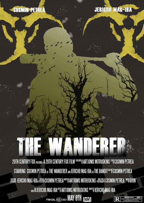
Poster Ideas
We went over various ideas that we had and put a list of points that we were inspired by:
-Torn Paper effect
-Grey-yellow tint
-Maybe cartoonish style
-Double-Exposure
-Main character seen from behind
-Gas mask close-up ?
-Torn Paper effect
-Grey-yellow tint
-Maybe cartoonish style
-Double-Exposure
-Main character seen from behind
-Gas mask close-up ?
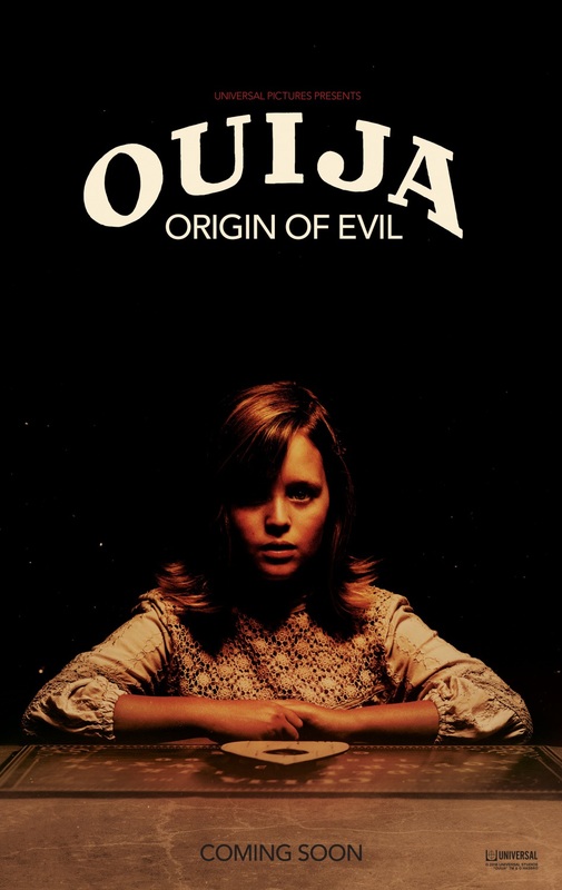
Ouija: Origin of Evil -Poster Analysis
|
The movie title is in a bold, white font that covers a large part of the poster and stands out due to the contrast between the font colour and the background colour. The font also fits in with with the "Ouija" name engraved on the actual board and gives the audience an idea of what the movie is about previous to seeing it. It also grabs the attention of the audience.
The lack of other elements within the poster leaves the audience to guess however it is rather effective as this same lack of elements can inflict some sense of distress as such a simple and dark poster is unique and therefore uncomfortable to understand. The fact that such a young looking girl is surrounded by darkness might make the audience sympathetic and even worried for her state of well being.
The distributing company appears twice while the production companies do not appear on the poster due to their lack of notoriety.
|
|

Shutter Island -Poster Analysis

|
The overall theme from the colour scheme to the unusual placement of the protagonist within a scene and the contrast between his detailed figure and the abstract looking island creates a sense of mistery. The orange match is contrasting with the blue sea to catch the audience's attention.


While not clear at a first glance, the match can symbolise the fact that light will uncover the mistery within the obscure island. The fact that the island is surrounded by mist makes the audience think that said island is far away from any civilisation and the thought of having a main character away from civilisation can draw sympathy from the audience and increase the mistery.

The lighthouse enforces the idea that this island is surrounded by water and the only way of transport away from it is a boat, just like the on in which our main character arrived in.
|
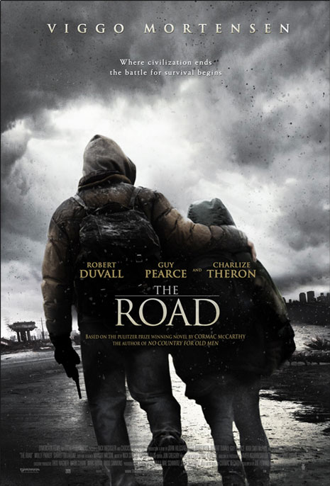
The Road- Poster Analysis
|
The main focus in the poster is the bond between the two characters and their surroundings. The pose of the characters, with their backs away from the camera denotes the idea that they are heading towards an important location. It could also give off the idea that they are trying to get away from

The buildings in the background denote the idea that the state of the world in which these two characters are living in has been deeply affected by some sort of catastrophe that endangered civilization.
|

Double Exposure Posters
|
Double exposure posters make use of silhouettes in which different elements from the movie are embedded in. The term comes from photography and refers to the way in which multiple elements from two or more exposures come together in a single image. This is effective as it combines multiple images without over complicating the final product.
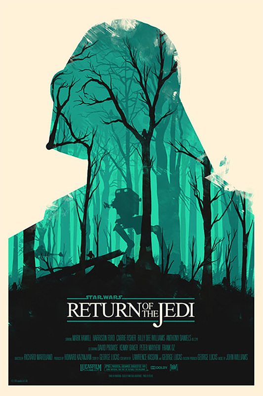
As seen to the left in the Star Wars example, the silhouette of Darth Vader is filled in with a forest in which AT-AT's or all terrain armored transport machines are visible. This is a clean way to show the involvment of darth vader and hint towards action scenes later in the movie by introducing the AT-AT's. |
Colour Contrast
|
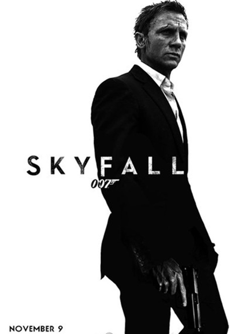
This style of poster is created using high contrast in colours, or rather the lack of them, and then some parts of the poster are coloured in red in order to give a connotation of action and danger which suit the genre of the movies.For example, In the poster for "Django Unchained" the title and the director name are highlighted in red in order for them to easily catch the audience's attention and due to the fact that Quentin Tarantino is a well known director and putting his name together with the movie name in red will make the audience associate the two and therefore they will be more likely to watch the movie.While lacking the colour red, the Skyfall poster is still a perfect example of lack of colour being used effectively as the black-white contrast give the poster an elegant look similar to how Daniel Craig as 007 is presented, being an elegant and swift spy. The title of the movie is firstly in black for the "Sky" bit however it changes to a white colour in order to create a contrast with 007's black suit which makes it stand out and is quite unconventional.The black-white contrast also shows the scarring on Daniel Craig's face making him look more battle-scarred and therefore making the poster more dramatic due to his dull expression due to his vast experience in the role of the 007 and the dignity and concrete personality that the character is known to have.
|


Illustration Posters
|
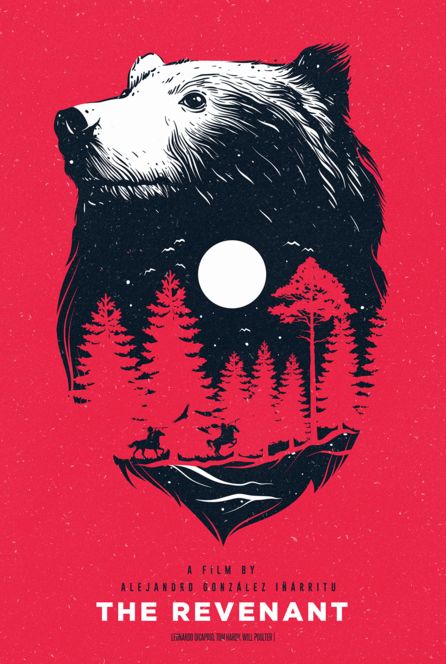
Illustration posters usually focus on really important aspects of a story and/or main character(s) in order to attract the audience without the need for a visual overload. In the example from "The Revenant" we can see the figure of a bear which turns out to be a very important aspect of the movie. It also comes with connotations of nature which is pretty much the place where most of the action of the movie takes place.
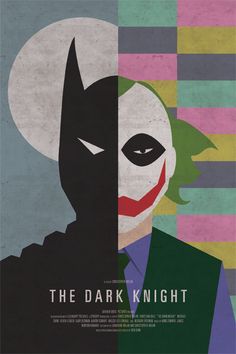
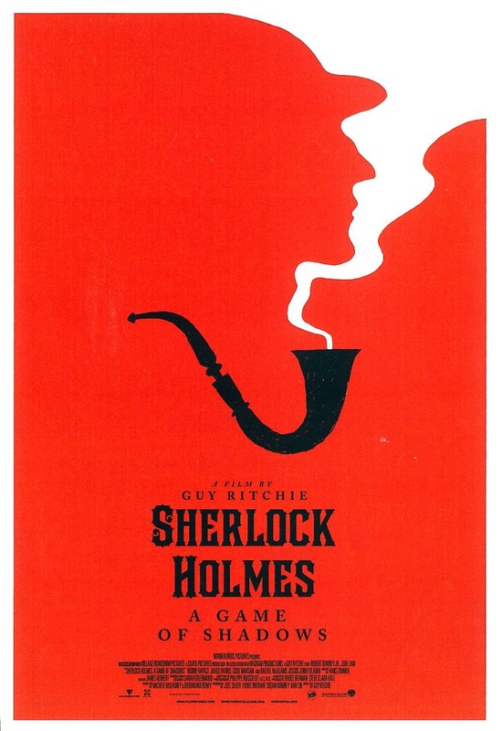
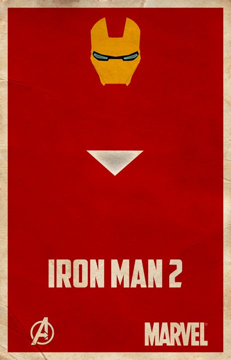
As for various of the other illustration posters, they usually depict key elements of the narrative in a very simplistic way. For The Dark Knight, we have half a silhouette of the batman side by side with half of Joker's . This not only shows that they are closely tied but it also goes to present both characters as contrasting in ideals yet still connected. For the Sherlock Holmes poster, the smoking pipe is a convention of detective movies, especially Sherlock Holmes, a classic of the genre. For Iron Man 2, we have the central core of Anthony Stark's suit. |
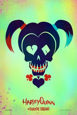
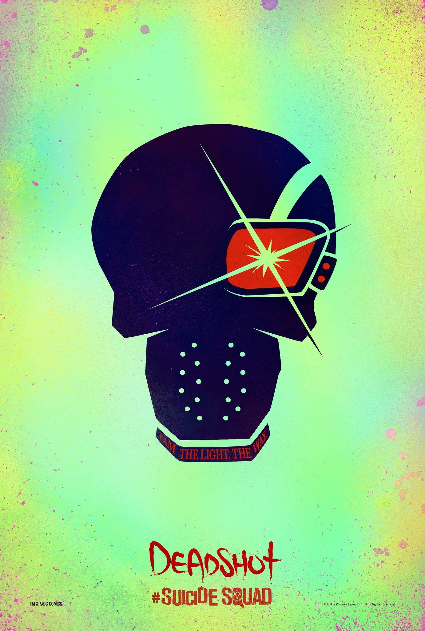
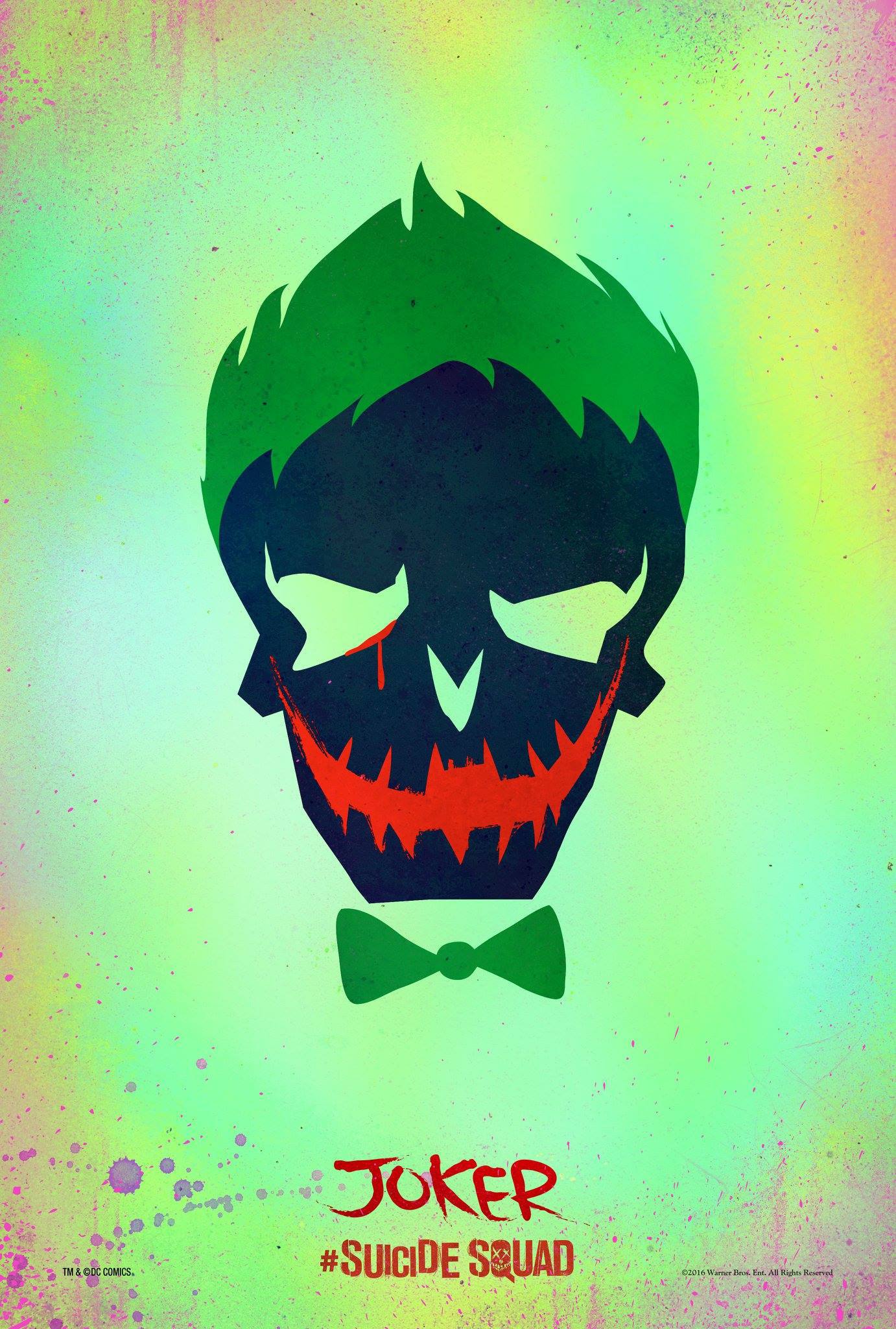
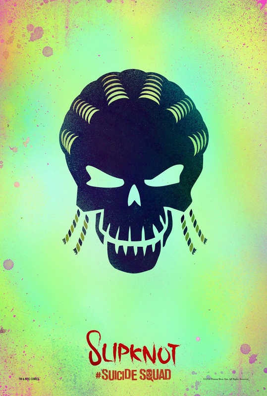
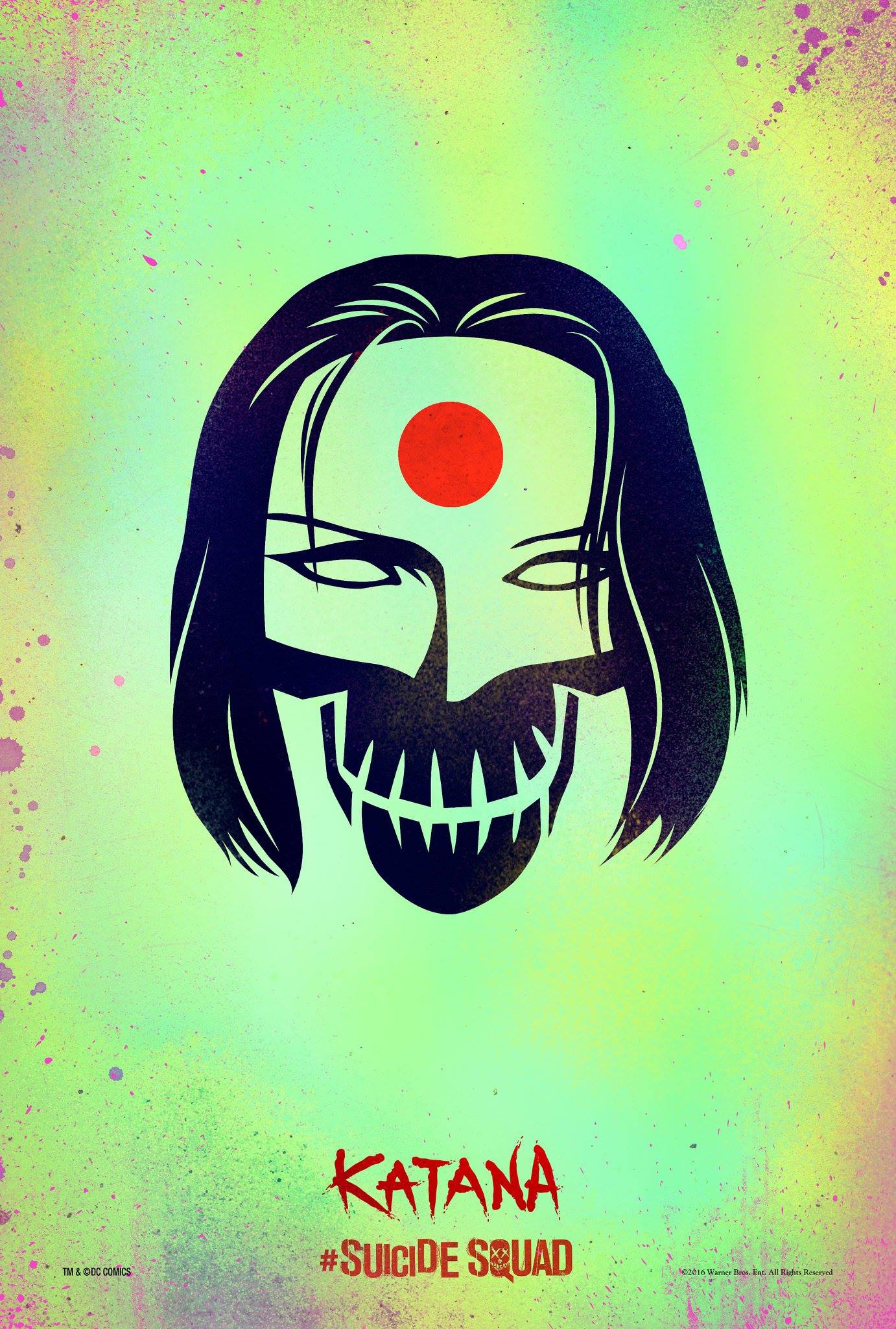
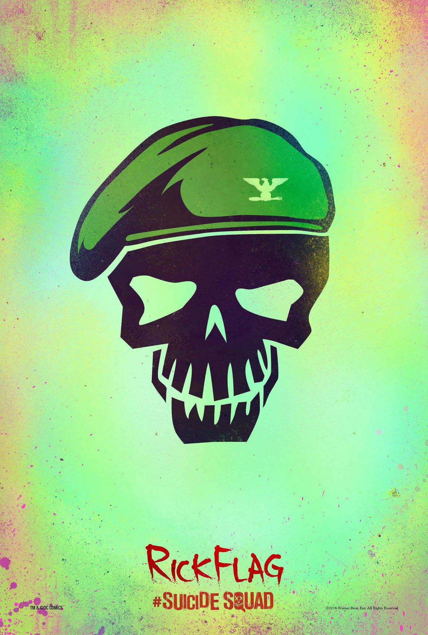
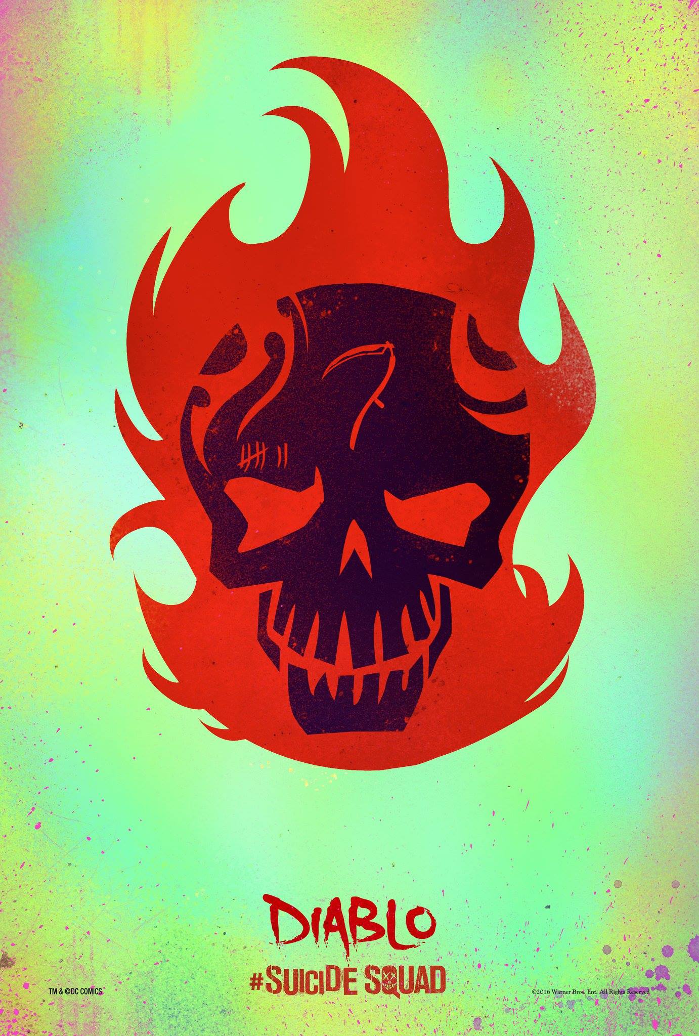
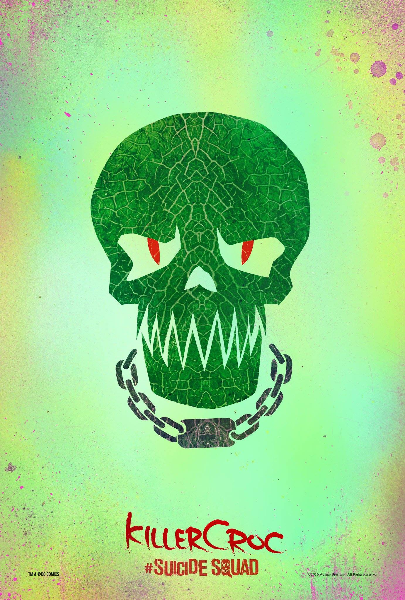
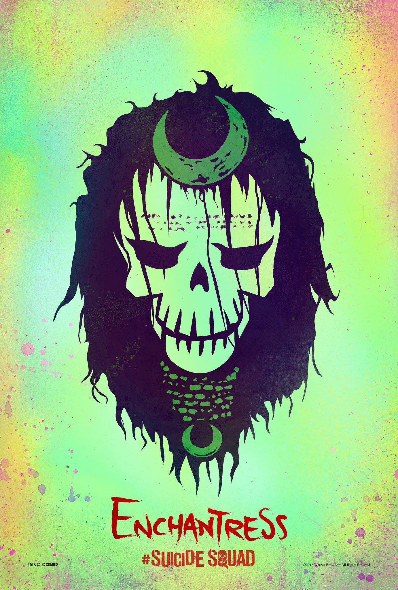
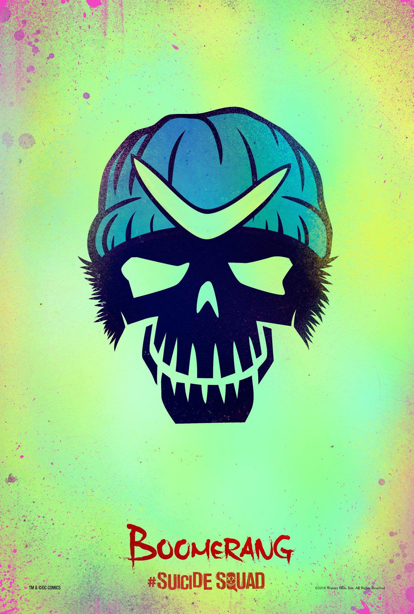
Character Posters-Suicide Squad
|
|
|
|
|
|
|
|
|
|
I found the character posters for Suicide Squad to be very effective as they portray key characteristics of the characters without much thought process from the audience. The name of the characters is in a red font contrasting the green background as it is more eye-catching and the names themselves are useful for the audience as some characters are not as notorious as others meaning that an audience that is not familiar with DC comics might not be able to understand what the character's names and abilities might be. The cartoony look also fits well as the movie was advertised as an superhero movie with occasional jokes along the way and these cartoony posters hint towards that with the red colours in the names of the characters hinting towards the action part and the style of the posters themselves towards the more casual, superhero theme.
While some characters such as the Joker and Harley Quinn are relatively easy to distinguish from other characters due to their popularity and distinct features, in order for the audience to pay attention to some of the secondary characters, only key features were shown as to not make the secondary characters appear dull. In order to bring the characters together they are all portrayed as skulls rather than having all their facial features showing which helps with making the posters appear to not be overly-complicated.
While some characters such as the Joker and Harley Quinn are relatively easy to distinguish from other characters due to their popularity and distinct features, in order for the audience to pay attention to some of the secondary characters, only key features were shown as to not make the secondary characters appear dull. In order to bring the characters together they are all portrayed as skulls rather than having all their facial features showing which helps with making the posters appear to not be overly-complicated.
Inspirations
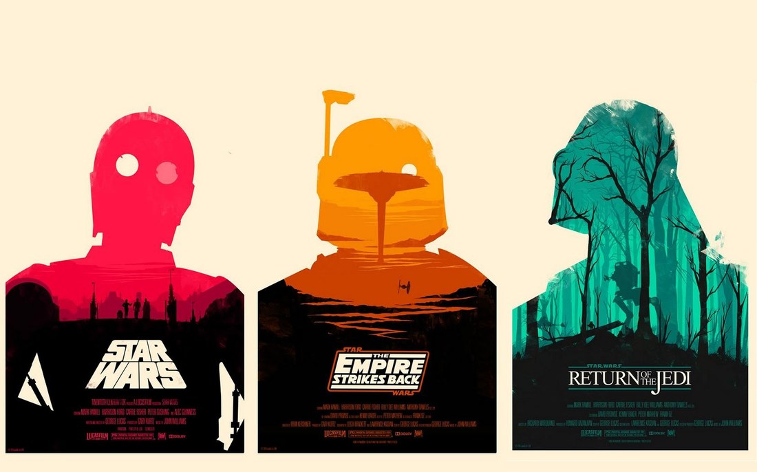
When deciding on what the main theme of our poster is going to be, after the research, we decided as a group that the person responsible for the poster should further research on techniques on how to achieve the double-exposure look seen in the Star Wars posters.
The artist to the left is called Olly Moss and he created these double exposure star wars posters. As seen in his posters, the builtd-up to the main part of a silhouette is usually in black in order to allow for different credits and titles to be seen. The details within the actual character silhouette are in either black or darker hues of the main filling colour and this gives a sense of depth. I will try to play around with different double exposure techniques and try to achieve something of similar effect. 
|
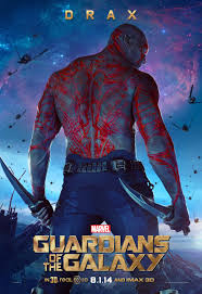
As the main theme of the poster was decided, I looked further for a poster that had one of the main characters posing with their back to the camera as we thought it would require less focus from the main actor to pose for a back shot compared to a front shot. I stumbled across the poster of Drax for Guardians of the Galaxy in which his back is facing the camera while his weapons are still visible. I decided that this pose should be tried within our upcoming photoshoot.
The poster for SkyFall comes with a colour contrasting theme which I thought would be quite effective as it also makes designing and editing the poster easier as something as a black-white colour contrast gets rid of some of the unwanted attention to bad photo details by eliminating the colour. The way in which the white text is placed on the black part of the actor's costume seemed very impactful and therefore I will consider inplementing a white-black contrast between the titles and the silhouette of the actor. |
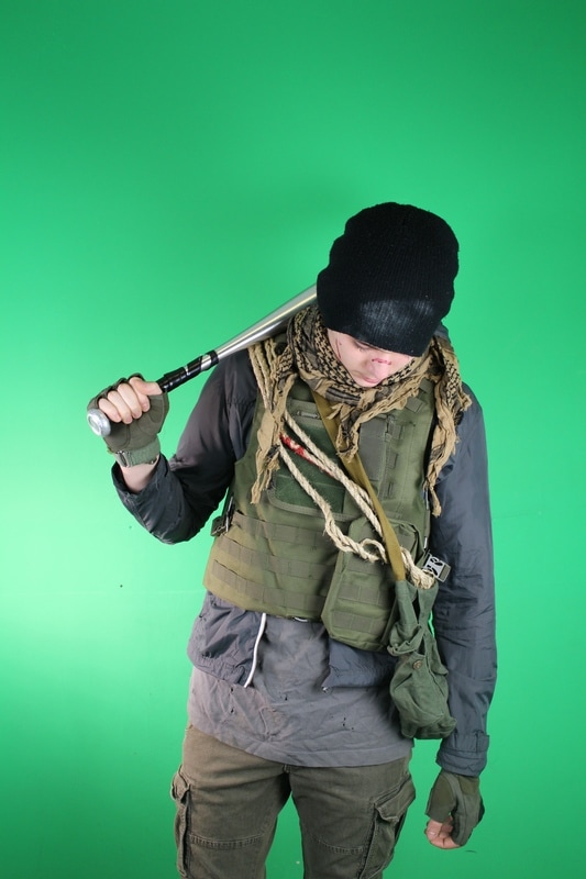
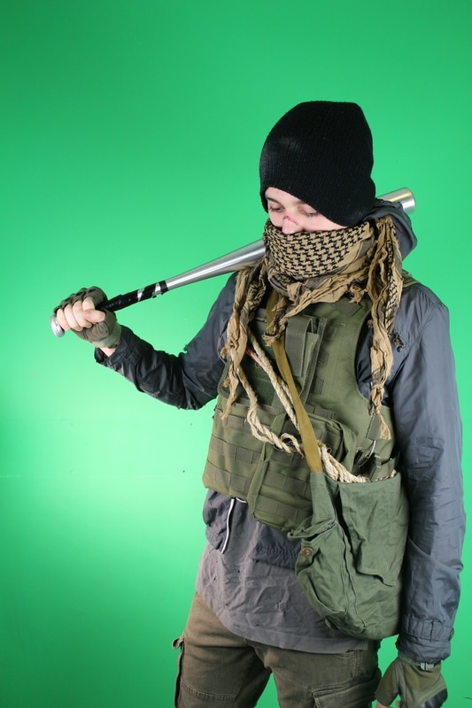
Photos for poster
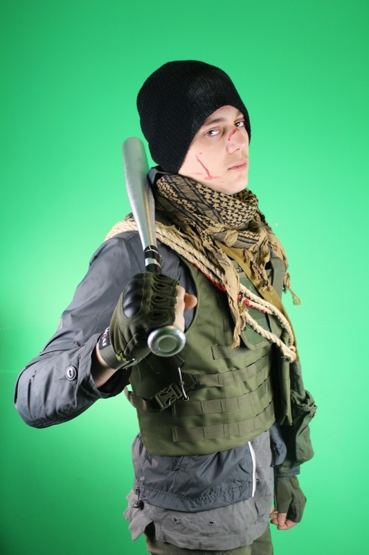
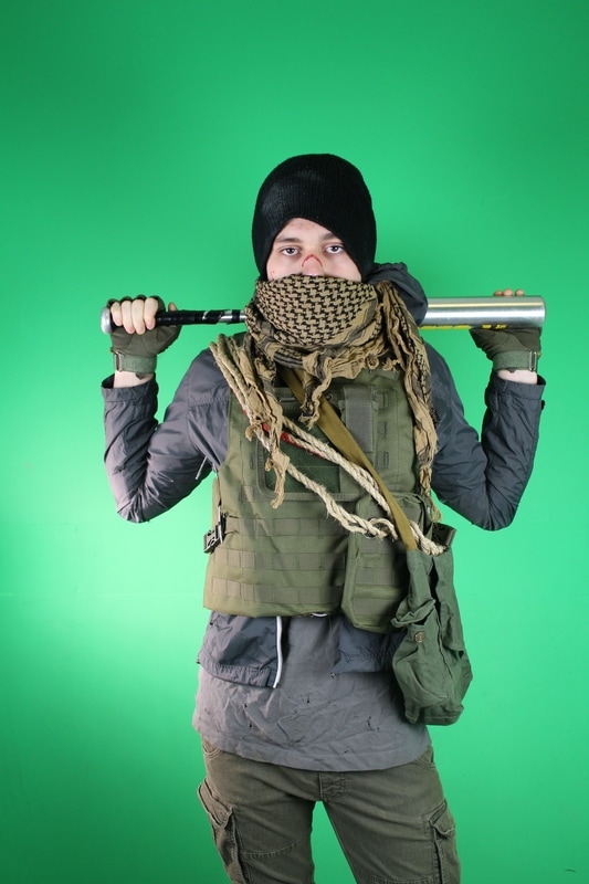
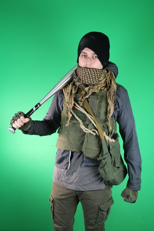
We arranged a photoshoot in order to get high quality pictures with the main actor, me. The make-up and some bits and arrangements of the costume were different from the trailer as we decided that the big jumper jacket will not fit our idea of how the poster will look as it made the main actor too bulky. We decided to get various poses as the pose itself was not set in stone however we knew that the bat will play a big part in showcasing that there is some sort of violence and action that will happen in the trailer and as such it became a focal point for the photoshoot.
|
|

|
|
|
|
Experimenting

|
|
|
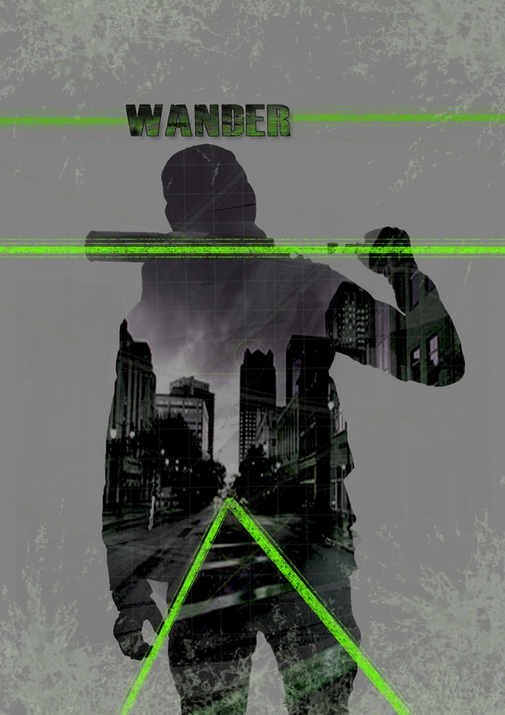
After managing to create a blank silhouette out of the main actor's photograph, I decided to experiment with ways in which double exposure could be used on the subject. It seemed fitting to have some sort of location within the actual character as, considering our inspiration from the star wars posters, within each silhouette there is a location.
I thought that it would be interesting to add some sort of elements to the image in order to make the composition more interesting and maybe develop from there and therefore two lines were placed following the orientation of the road in the image, another line was placed alongside the bat and a third line was placed on top of an incorrect title of the movie. While editing the title layer i decided to keep it to "wander" as it"The Wanderer" was more complex and would take more space. From these experiments onwards, the title is always correct as we approached final stages of development.
I thought that it would be interesting to add some sort of elements to the image in order to make the composition more interesting and maybe develop from there and therefore two lines were placed following the orientation of the road in the image, another line was placed alongside the bat and a third line was placed on top of an incorrect title of the movie. While editing the title layer i decided to keep it to "wander" as it"The Wanderer" was more complex and would take more space. From these experiments onwards, the title is always correct as we approached final stages of development.
More experimentation
|
|
|
The posters in this set are closer to the main inspiration, the posters created by Olly Moss. The block colours are saturated and they create a contrast with the background and the different black elements while the integrity of the silhouette and different details and textures remain. The moon element was straightly taken from one of Moss's posters and while not relating in any way with our trailer, it works as an idea of how different elements would look within the silhouette.
A change in hue also showed that the yellow and green hues go together with the post-apocalyptic theme while the third poster having a blue hue does not match general ideas of post apocalyptic movie posters. Knowing this, I will use green and yellow tones in my upcoming experiments and posters. Also, the detail shown from the vest seems rather overwhelming and too messy and therefore it is likely to be scrapped in the future.
A change in hue also showed that the yellow and green hues go together with the post-apocalyptic theme while the third poster having a blue hue does not match general ideas of post apocalyptic movie posters. Knowing this, I will use green and yellow tones in my upcoming experiments and posters. Also, the detail shown from the vest seems rather overwhelming and too messy and therefore it is likely to be scrapped in the future.
Preliminary poster

|
With the preliminary poster, we focused more on the main parts of the poster aka the silhouette.
The images below come from the location of one of the scenes and the photoshoot taken with the main actor in order to get good quality images for the poster. This was one of the more in-depth experimentations towards achieving our main final poster. The font sizes, arrangement and contrast in colours was still to be played around with yet the overall composition was taking shape.
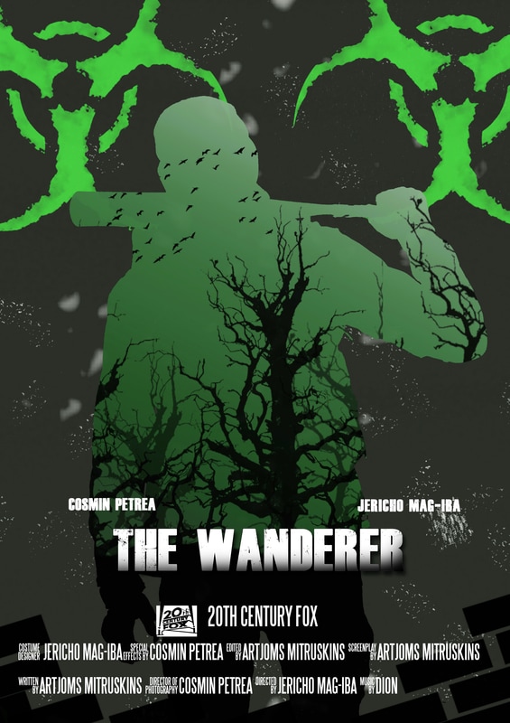
During the creation of this somewhat finalised version of a poster I observed that the colour of the billing block was quite pleasant while the strong contrast in the upper part between the black silhouette and the grey-green background looked messy and unfinished and I considered reversin the tones in my final poster.
|

As we went over this iteration of the poster we realised as a group that there were some elements lacking in order to distinguish the poster as being of a post-apocalyptic movie. In order tofix that, some of the elements of the poster and some of the colours had to be adjuster. I decided to search for a toxic waste brush however I ended up modifying an existing one and making my own version of it. I also took some inspiration from one of the star wars posters from Olly Moss and decided to implement some trees within the silhouette. This fits with the post-apocalypse theme as it implies that nature has been somewhat damaged in the process of the nuclear war that will be shown in the trailer.
|
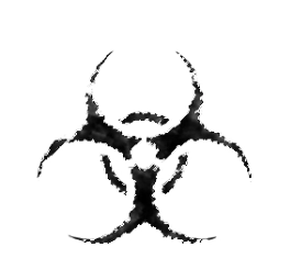
As seen to the left, this is the brush I modified and used for the toxic waste symbol in the final poster.
To the right, there is a small cut-out of the poster in which it is visible that the bird brush has been used. The birds are heading up showing that they are fleeing from possible danger. Birds are also generally shown in movies whenever there is some sort of human or animal remain as they would usually utilise said remain as food. This is an underlying idea that the bird brush showcases and while hard to pick upon by the audience, our more mature and nerdy audience should be able to pick upon this as it is conventionally used in various media to convey danger. |

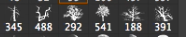
The brushes above are a selection of tree brushes. I decided to use the more leafless of the set in order to convey the idea of the damage caused to the nature. While this is not shown within the trailer, it is there as a symbol of the genre and helps us meet some expectations.
|
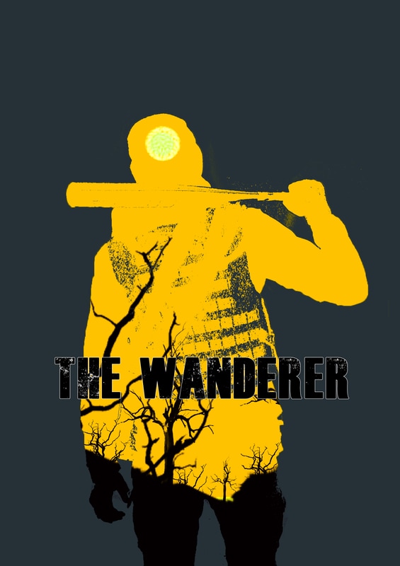
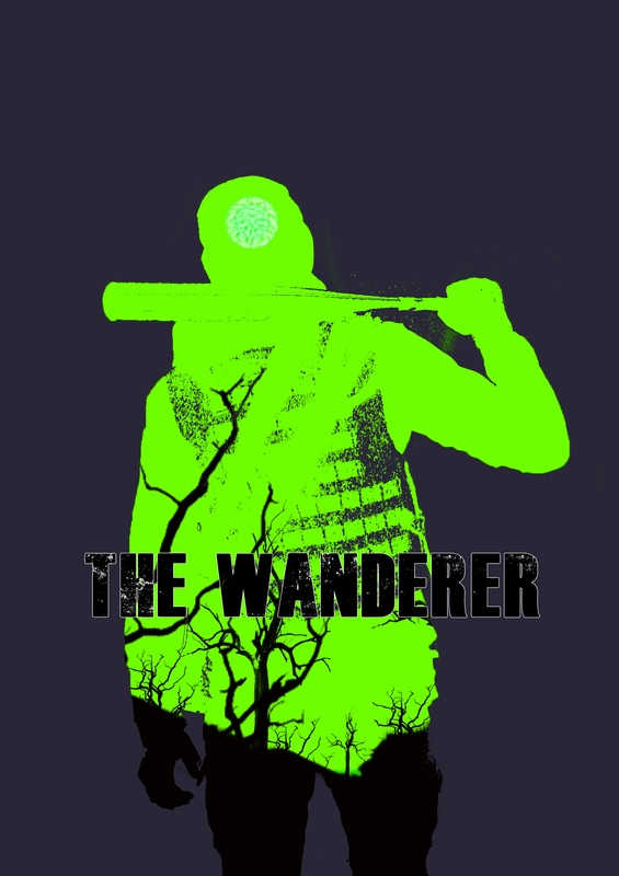
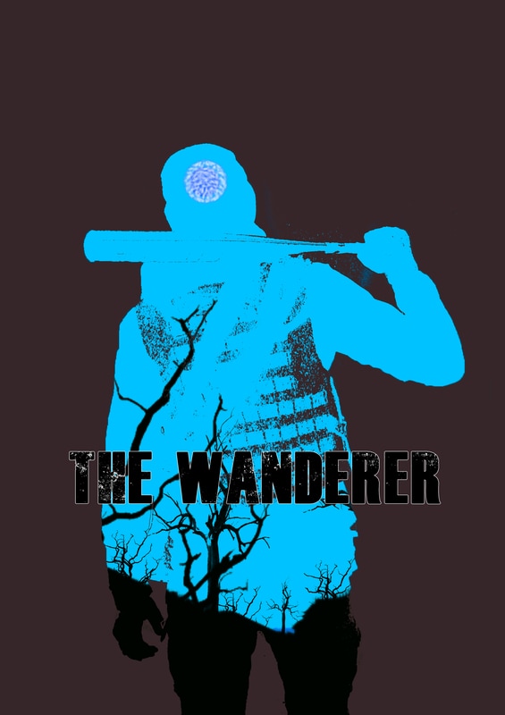
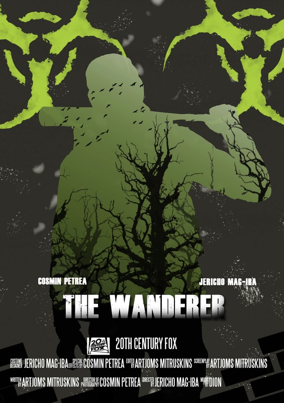
Three final choices
|

|
|
While the green shade on the left is conventioanl with ideas such as plague and toxic waste, we decided that the colour was too bright and too eye catching making the whole toxic waste idea appear as too much of a central idea which we did not intend for. Meanwhile, the green shade to the right is more dull and toned down however we feel like that shade of green hints towards a rather lively aftermath to the post apocalypse as the green gives out the idea that there is a possibility for nature to have recovered and while having such an oxymoronic idea embedded in our poster would be interesting, we decided that the yellow shade in the middle works better as it provides a worn out look and that is something we like.
Pre-Final Poster
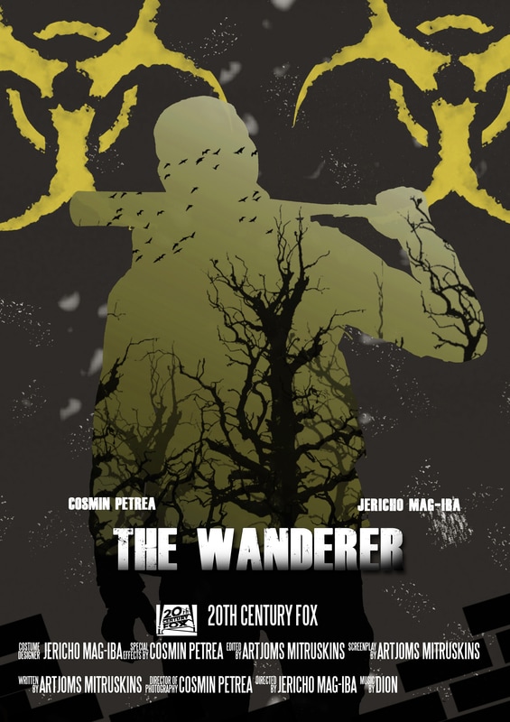
Final Poster